
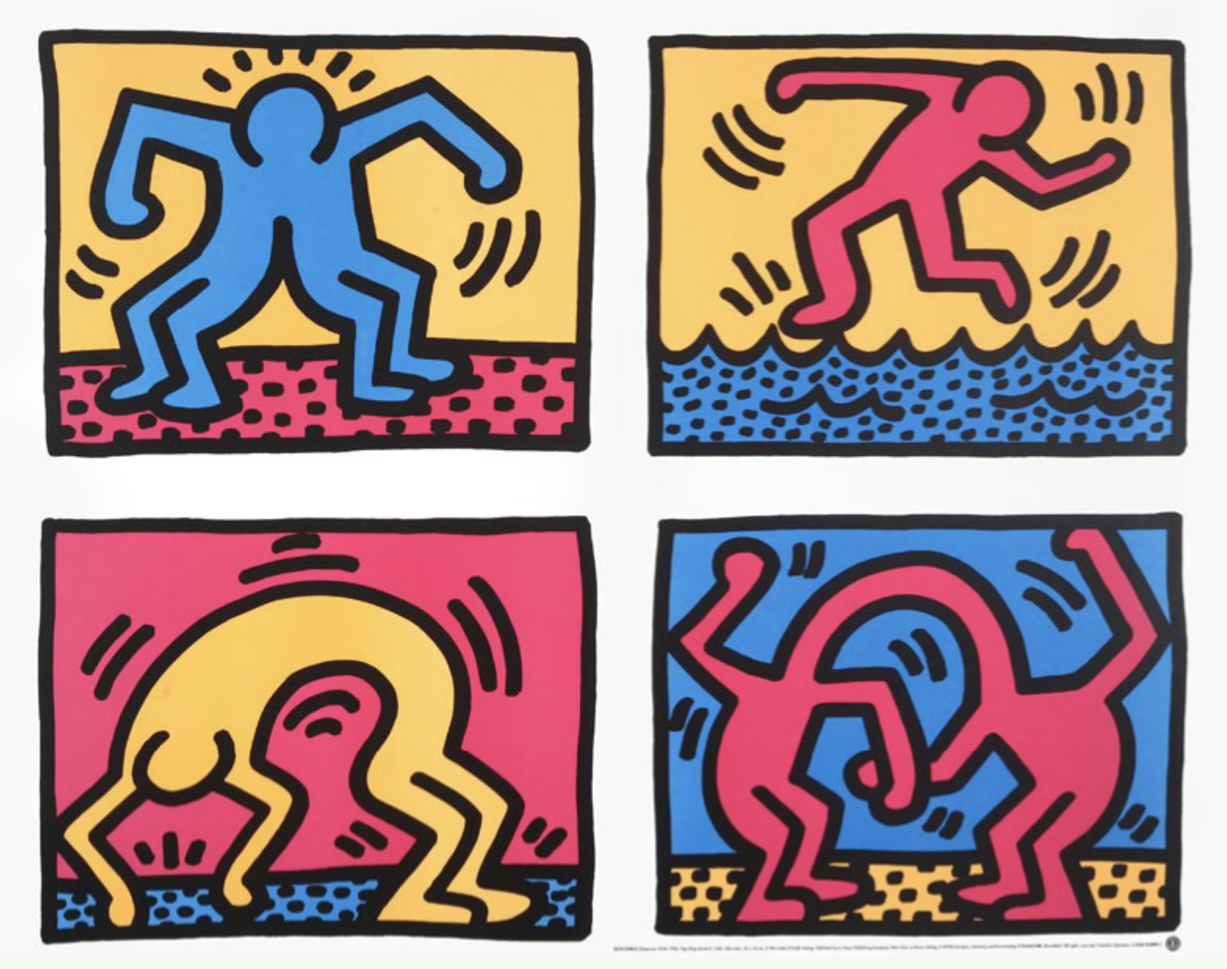
Pop Shop Quad II, Keith Haring, 1988 (Printed later)
Lehigh University Art Gallery defines wellness as “a dynamic relationship between mind, body, and spirit.” Keith Haring’s image does this really well.
The image is decided into 4 squares, much like a comic, and the image only uses 4 colors; pink, yellow, blue, and black. Each square depicts a cartoonish person actively doing an activity. In the first square, the person has 4 legs and seems to be doing something like a jumping jack or has taken on a stance much like someone showing off their muscles. This is the emphasis on the body. In the second square, the person is running across water. This could signify either an emphasis on body or spirit. In the third square on the bottom left, the figure is bending their body all the way over, much like a pose you would do in yoga. Yoga seeks to unify the body and spirit so this panel does that as well. In the fourth and final square, two people are combined where the head would be. This puts emphasis on the mind.
The very basic color palette allows the viewer to only focus on the person rather than any excess detail. This allows the viewer to focus on the person and what they symbolize.