
Book Link: https://www.blurb.com/bookstore/invited/8981636/8f63ce16c9dc170e11b0b58f9d6add2ab8135a28
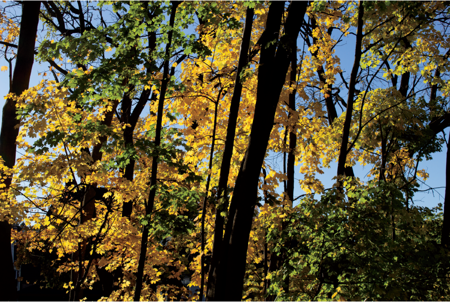
This book is a composition of the beautiful colors that you can find in nature during the season of Fall. Fall is not about leaves dying, its about the bright pop of color that they add to our life. The yellows, the reds, and shades of brown are appreciated in these photographs.
I liked that each page on a spread worked really well together compositionally and with the color in each. The photos were elevated by your use of lighting through the leaves and to create dramatic shadows. The only thing I would say is your cover could have been more engaging by choosing a different photo that you had and a more standard text. Your written content in the introduction of the book and for yourself was perfect, Great job!
I love the color choice that you chose for your title page (first page of your book) it really adds interest to the rest of the book with the word color, however, I wonder if the word would be even more intriguing if each letter was a completely different color. The way that you transitioned from the first few pages focusing on a single vibrant leaf to a whole bright forest really caught my eye as well. Somehow you managed to make each page feel like a completely different setting, which Is really impressive to me, good job!
I really love your whole book, it is so cohesive as a whole and the spreads look great together. Your full spreads look great, especially the one with the one tree going down the center works really well as a full spread. I love the one with the red leaves and Linderman in the background. The colors look so great together with the blue sky contrasting the red leaves. Your water photo is really beautiful too. Great work with your book it looks awesome!
The matching that you do page to page really allows all of your images to compliment each other, and I think the book turned out awesome. Fall colors are so nice to work with, and your editing techniques added to the images but were still subtle. I also especially like your full page spread towards the middle of the book!