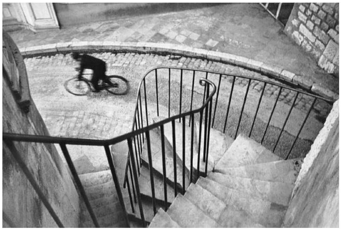
Henri Cartier Bresson, Hyères, 1932, Silver Gelatin Print
I chose this photo because of its simplistic beauty. There isn’t a whole lot going on in this photo, it isn’t overwhelming and it doesn’t cause any intense emotions. It uses geometry and leading lines to draw the eye from the bottom left corner of the photo and up and around to the person on the bike. I think it is cool because the staircase is completely still and in focus but the person on the bike was captured at a low shutter speed to create motion blur. I like that juxtaposition of still verse movement.
I think this photo goes to show that an excellent photo can be simple and it doesn’t need to be overthought.

