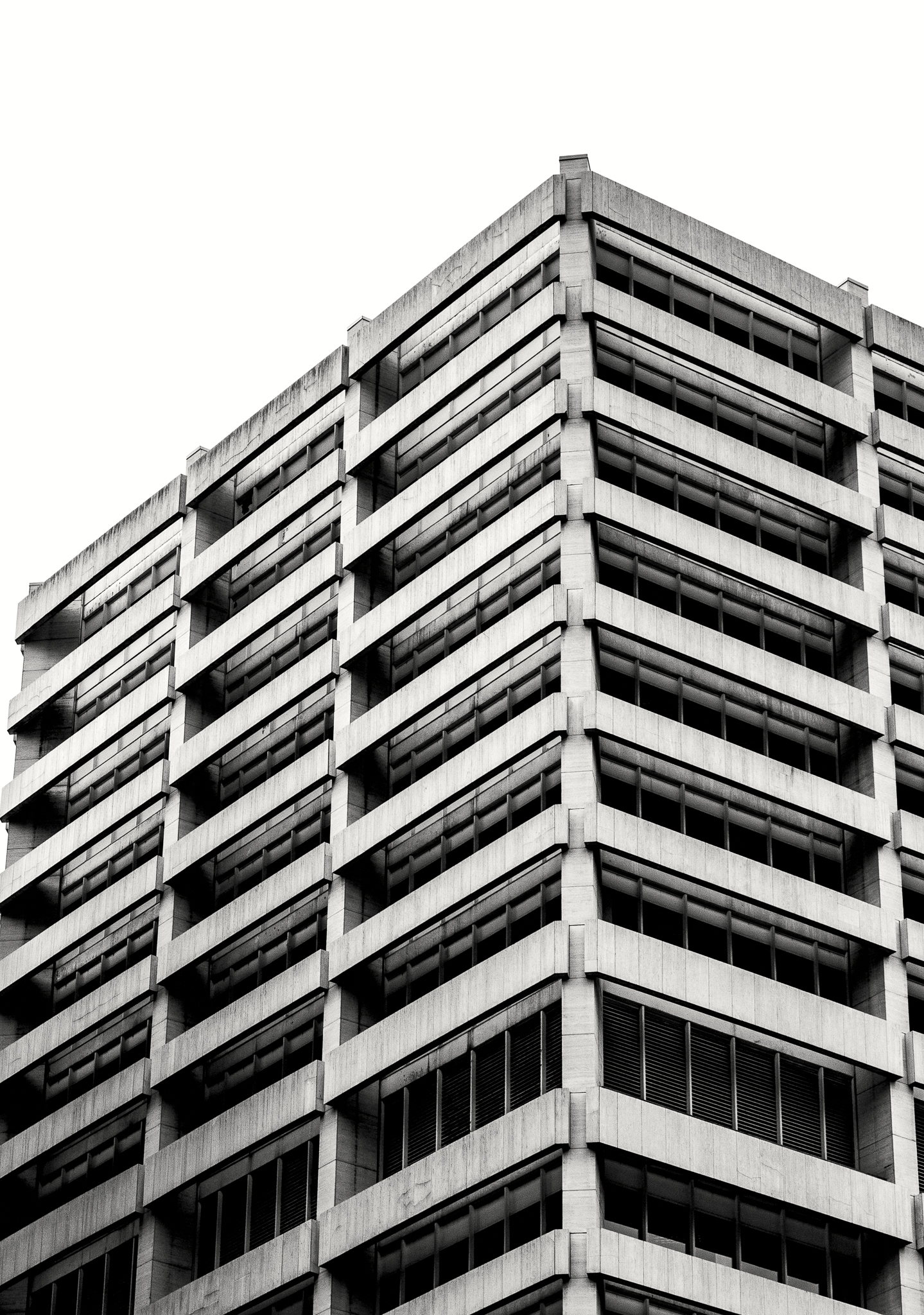
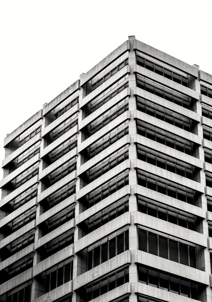
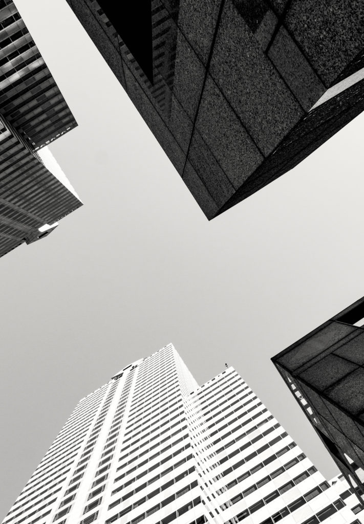
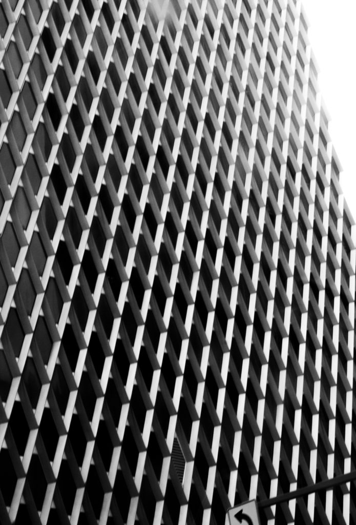
For my project I decided to highlight the geometry that surrounds our everyday life, specifically in architecture. I wanted to focus on repetition of forms and use black and white edits to further each photo’s impact. Overall I was pretty pleased with how my book turned out. I think one of the most important lessons I learned throughout the process was to shoot less, but focus more. Instead of taking a million pictures, I want to slow down and focus on quality over quantity.


Black and white was an exceptional choice! I really like how it forces us to really concentrate on the architecture because it takes away the element of color.
I think you did a really good job on choosing the subject matters of those photos and I love the compositions and geometric shapes of them! There are a lot of extended lines that created by the buildings which really attracted my attention.
I love the perspective in these photographs. I think you managed to make something usually pretty boring (a building) into a dynamic composition to look at. Overall I enjoy this collection and the decision to use black and white photography really enhanced the shots.