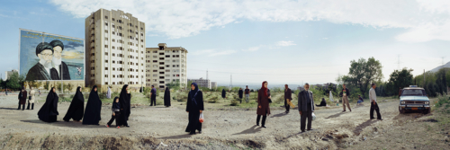
Mitra Tabrizian accomplishes something very interesting with the composition in this picture. The use of perspective and angles creates a very engaging picture. The foreground of all the people is very interesting in that there are so many figures and while they are all in the same frame, they seem to be each in their own world as they walk in different directions with almost none of them interacting with each other. This creates a really interesting organized disorganization in this aspect of the photo. Then extending into the background the large buildings give the photo a really good sense of scale, but also warping the perspective again. Past the building there are telephone wires and other structures that extend all the way to the horizon, this creates a great sense of depth in the photo.


Yes I agree with your analysis of the disorientation despite the fact that the artist deliberately arranges the subjects in an elliptical shape pictorially. How do the billboard and the car function in the the composition and content?