Long Depth of Field:
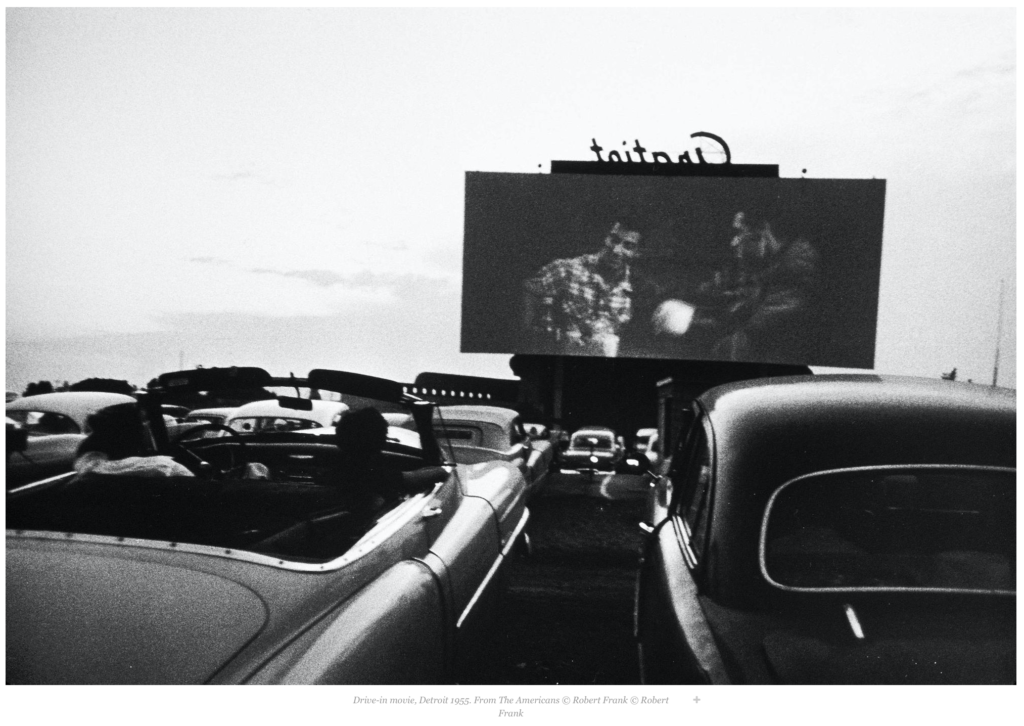
In this picture by Robert Frank, the cars in the foreground and the movie screen in the background are all in focus which makes it a long depth of field. The composition is great because of the use of leading lines from the cars to the screen. The image also uses the rule of thirds because the screen is right-justified. Depth of field is important here because the image relies on all objects so they must all be in focus.
Short Depth of Field:

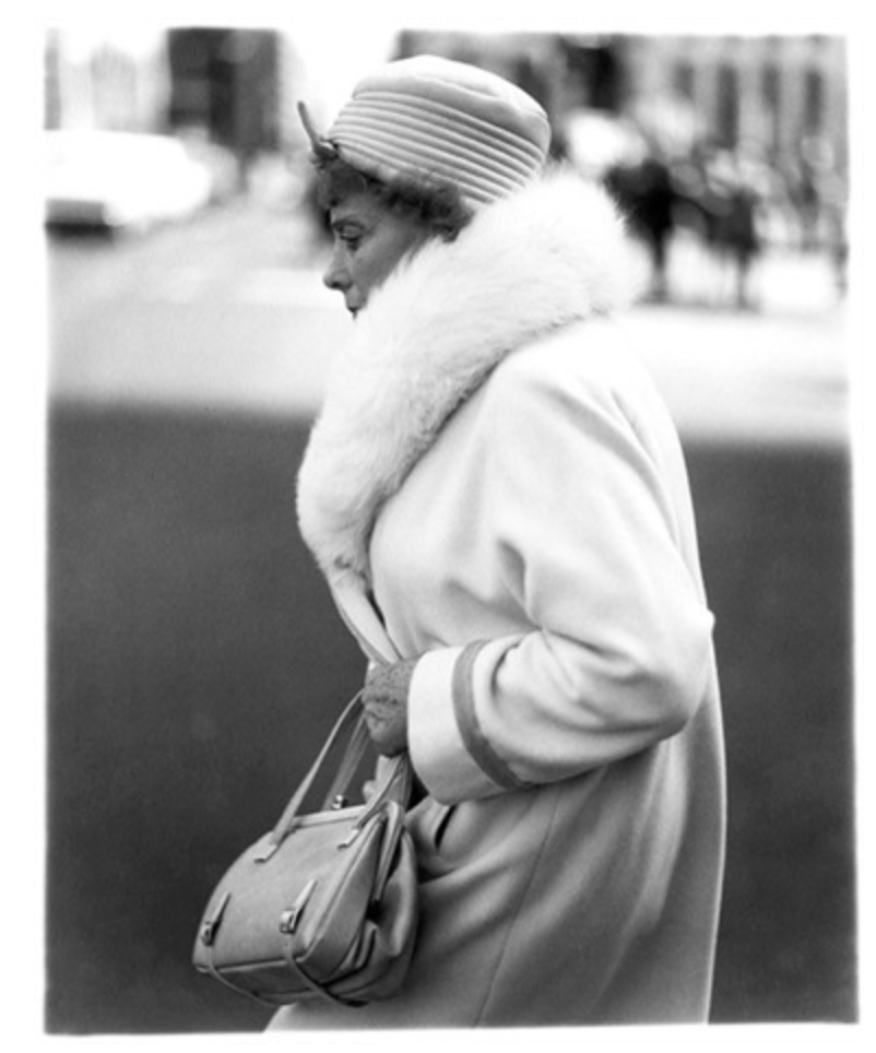
This image by Diane Arbus relies on depth of field to make the picture because the subject of the photo is the woman and the background is irrelevant so the artist chose to only have the woman in focus. This a good photo compositionally because the woman’s head is centered nicely in the center top of the photo and her body is centered in the middle third of the entire picture. There is equal space on either side of her body. The edges of her coat also create beautiful curves.


Nice analysis of the leading lines of the cars to the screen. I also like your observation of shape and space in the bottom image.