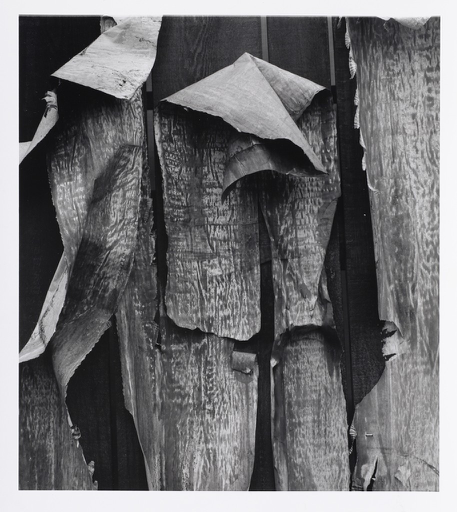
Aaron Siskand’s black and white image. New York 1, 1988. There is a lot of texture in this image. In the photo there seems to be pieces of material folding over and in several different directions. Some of the material is darker than the other areas of material. The front side of the material has more texture than the back side of the material. Behind the material seems to be planks of wood. The different types of texture seem as if they were taken from a natural space. None of the lines in the photograph are consistent with one another. There is a sense of randomness in the pattern. There are many different lines and shapes throughout the photograph.


It does seem as those the surface coming off the backing has a common texture – as if it was part of a billboard or poster.