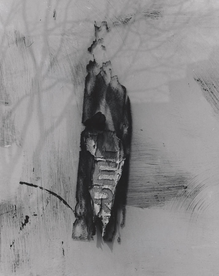
This is a rectangular black and white photograph by Siskind. The picture is supposedly taken at a wall, giving the whole image a “flat” look. There is no clear meaning or story telling element involved, which means this photograph is abstract, a main style of Siskind’s works. The focus of this image is in the middle: a black paint stroke with three letters revealed beneath. The letters have a crumpled-paper-like texture, giving them an old and rotted look. The tearing and the crumpled texture kind of give the letters a sense of “layer”. The sharp contrast between black and light grey draws the viewer’s attention immediately to the middle of the image, then downwards. Scratches, random paint scatters all concentrated at the lower half of the image. Looking at it more closely, the viewer will notice the shadow in this composition gives a richer context about when and where is picture was taken. We can see a light and soft shadow of a bare tree, the branches of which starts at the left side and spread over the top half of the photograph. The visible shadow indicates the fact that this was taken at a sunny day, and the bare tree gives a hint that this picture might be taken at fall or winter. We can also vaguely tell that there’s a building nearby from the boxy shadow almost taking over the entire frame. Upon further observation, we can see the paint mark itself also has a slight drop shadow, which suggests this wall might have a glass panel laid on top. The image might look flat at first, but the more you look at it, the more depth and sense of space it reveals.

Good observations of space, shadow and light, and depth. This is a detailed description.