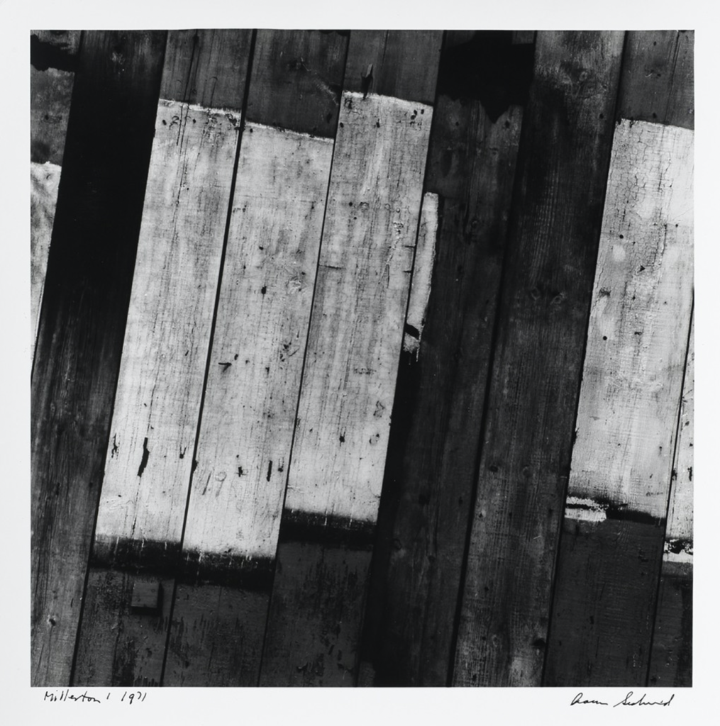
This is the slide 13 on the Aaron Siskind slides on the Blog Resources page(http://art007fall2020.luaad.com/index.php/my-new-page/). The title of this black and white image is Millerton 1 and it was taken by Siskind in 1971 in Rhode Island. The subject of this image is not as obvious as characters or objects. I can see the textures of wood planks just like the floor/ceiling of a cabin, or some kinds of wall or barrier. It is old with cracks, scratches, and surface defects. The white wood planks are jointed with black planks and the darker black between their junctions gives this image a three-dimensional feeling—the white planks are laying above the black planks with shadows. Siskind put the white planks in the middle of this image which makes the audience more focused on them. This composition gives a clear contrast between black and white. The half-baked white planks on the right and the left end of this image make it seems extensible with the illusion of these white planks will keep going toward the right and left ends. If we look at this image as a whole, we cannot tell the exact subject of it but a pattern, so I would place this work into the category of abstraction.


Good observation of value and texture and of framing.